A connected design system.
A clearer path through care.
Follow the wireframes, inspect the UI screens, and explore the shared rules behind a family-facing Silvie app concept.
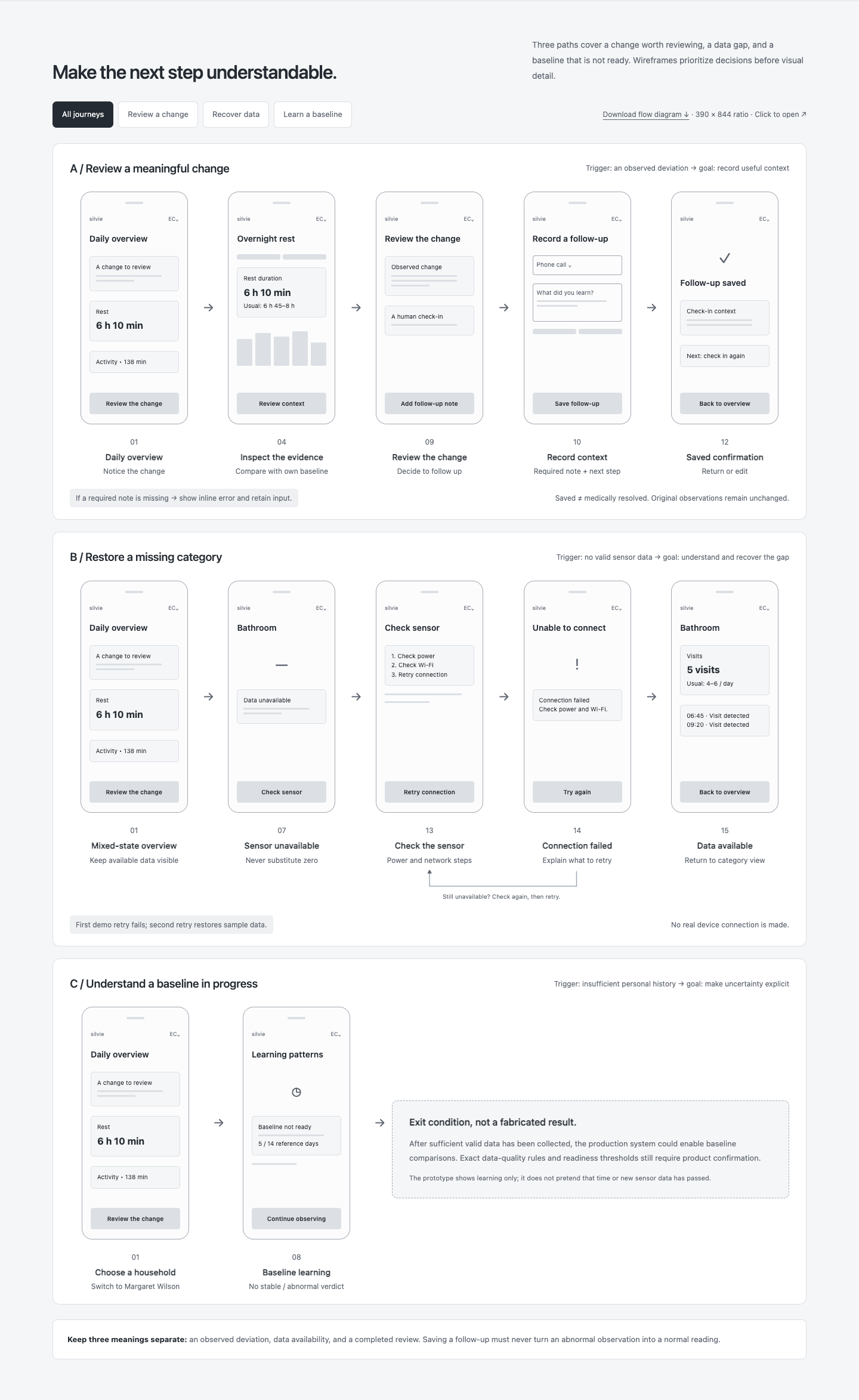
Make the next step understandable.
Three paths cover a change worth reviewing, a data gap, and a baseline that is not ready. Wireframes prioritize decisions before visual detail.
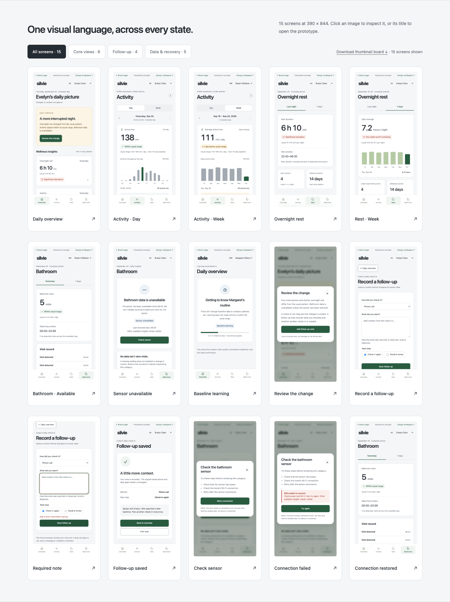
One visual language, across every state.
15 interactive starting points. Click a screen to use the app: navigate, explore data, and try complete tasks.
Shared foundations. Consistent meaning.
A code-based mini system, with raw tokens, semantic roles, reusable patterns, and explicit states. This is not a published Figma library.
Typography
Clear at a glance.
Native system sans for navigation, labels and data. Use the platform’s available face; no remote font dependency.
Care, with room to breathe.
Editorial serif for brand storytelling only. Do not apply it to charts, form labels or dense monitoring screens.
48 / 1.2 / 50032 / 1.2 / 60024 / 1.3 / 60018 / 1.4 / 500A change in routine provides context for a human check-in.
14 / 1.6 / 400Own 14-day baseline · Complete reporting period
12–13 / 1.5 / 500Reading rhythmUse one clear title, a short explanation, then content. Avoid all-caps paragraphs.
NumbersUse tabular numerals for totals and charts. Keep units smaller, but readable.
Scale boundaryValues apply at the reference size. This presentation canvas scales as a whole by request.
Color
Neutral surfaces. Meaningful color.
White and cool-neutral gray carry the page. Green is reserved for primary actions and a small stable-state accent, never the entire canvas.
| Semantic role | Use | Avoid |
|---|---|---|
| Action / #285B40 | Primary CTA, current interactive state | Tinting full sections or all headings green |
| Stable / #F0F5F2 + #285B40 | Known data within the household’s usual range | Using stable for missing or uninitialized data |
| Deviation / amber or red | Degree of observed change, with text | Inventing a clinical diagnosis from a reading |
| Data state / blue-gray | Learning, unavailable, incomplete | Mixing technical availability with severity |
| Focus / #375E96 | Visible keyboard focus ring | Replacing focus with a subtle background tint |
The allocation strip describes the intended visual balance, not a measured pixel percentage. Contrast ratios below each semantic pair are calculated from the actual token values.
Download version 1.1 tokens ↓Icons
One family, twenty useful symbols.
24 × 24 viewBox · 1.75px stroke · rounded caps and joins · no filled or emoji substitutes.
Metric category and daily movement.
#ds-activityAction targetsPlace a 20px icon inside a 44px or larger control. The glyph size is not the target size.
MeaningPair unfamiliar icons with text. Icon-only controls need an accessible name.
ConsistencyKeep stroke weight, optical center and corner treatment consistent across views.

Components
ActionButton
Primary and secondary hierarchy. One primary action for a task; minimum 44px control height.
StatusBadge
A small semantic surface, icon and explicit label. Severity and data availability may coexist.
MetricCard
TextField
Add a short note before saving.
Persistent label, clear helper text, inline validation and visible focus.
SegmentedControl
Day · one complete reporting period.
The selected period changes content. A background change alone is not enough.
ChoiceControl
Single choice uses radios, not independent checkboxes.
BottomNavigation
Four stable destinations. Icon + label, current-page indicator and consistent hit area. Contextual forms stay inside their originating journey.
Dialog / StatePanel
Named heading, clear close action, Escape support and contained focus. Use interruption only where the task needs it.
States
Interaction states
State specimens demonstrate appearance. “Try loading” runs a local visual example only.
Product-state contract
| State | What it means | What the UI must show | Recovery / next step |
|---|---|---|---|
| Available | Valid category data exists. | Value + unit + period + own baseline | Inspect the supporting context |
| Deviation | A change relative to personal history. | Degree of change, explicit reason | Review and record a follow-up |
| Learning | Baseline is not ready. | Why comparison is unavailable | Wait for sufficient valid data |
| Unavailable | Sensor data cannot be assessed. | Affected category and last valid time | Check power / network and retry |
| Empty | No follow-up has been recorded. | Helpful explanation, no fake content | Add the first note |
| Input error | A required note is missing. | Inline error tied to the input | Retain input and focus the field |
| Connection error | Retry did not recover the sensor. | Failure reason without blame | Recheck, then try again |
| Saved | A local follow-up was recorded. | Summary + edit + return | Keep original observations visible |
Patterns
Review → record → return
Preserve the observation while recording the user’s response.
- Show change and baseline.
- Capture reported context.
- Validate without losing input.
- Confirm, with edit and return.
Unknown → check → recover
Keep technical availability separate from wellness interpretation.
- Name the affected category.
- Explain the missing period.
- Offer a device check.
- Support a retry after failure.
Extend → document → verify
A lightweight proposal for a solo design concept.
- Reuse an existing semantic token.
- Give new variants a real use case.
- Update docs and captures together.
- Review contrast, states and focus.
Spacing4 / 8 / 12 / 16 / 20 / 24 / 32 / 48px. Tight within groups; generous between tasks.
Geometry6px badges, 8px controls, 12–16px surfaces. Borders for grouping, shadows for dialog elevation.
Motion160ms feedback; 220ms transitions. Reduced motion keeps the state change, without animation.
Version 1.1 consolidates the neutral palette, type scale, 20 SVG symbols and state contracts. This is a code-based mini system, not a published Figma library.
Close the gaps between
looking and following up.
The new screens extend the existing daily views. They focus on task completion and recovery, without adding diagnosis, messaging or real device control.
Explore the complete prototype ↗- New: follow-up record and confirmationContact method, required note, next step, validation and edit.
- New: recoverable connection failureThe first demo retry fails; a second retry restores illustrative data.
- Documented: baseline learning and mixed statesInsufficient data remains unknown; review progress remains separate.
- Evidence boundarySample data and local memory only. No user-study results, clinical validation or production metrics are claimed.